"Casper" (casperiv)
08/15/2013 at 11:37 • Filed to: None
 1
1
 11
11|
"Casper" (casperiv)
08/15/2013 at 11:37 • Filed to: None | 1
| 11 |
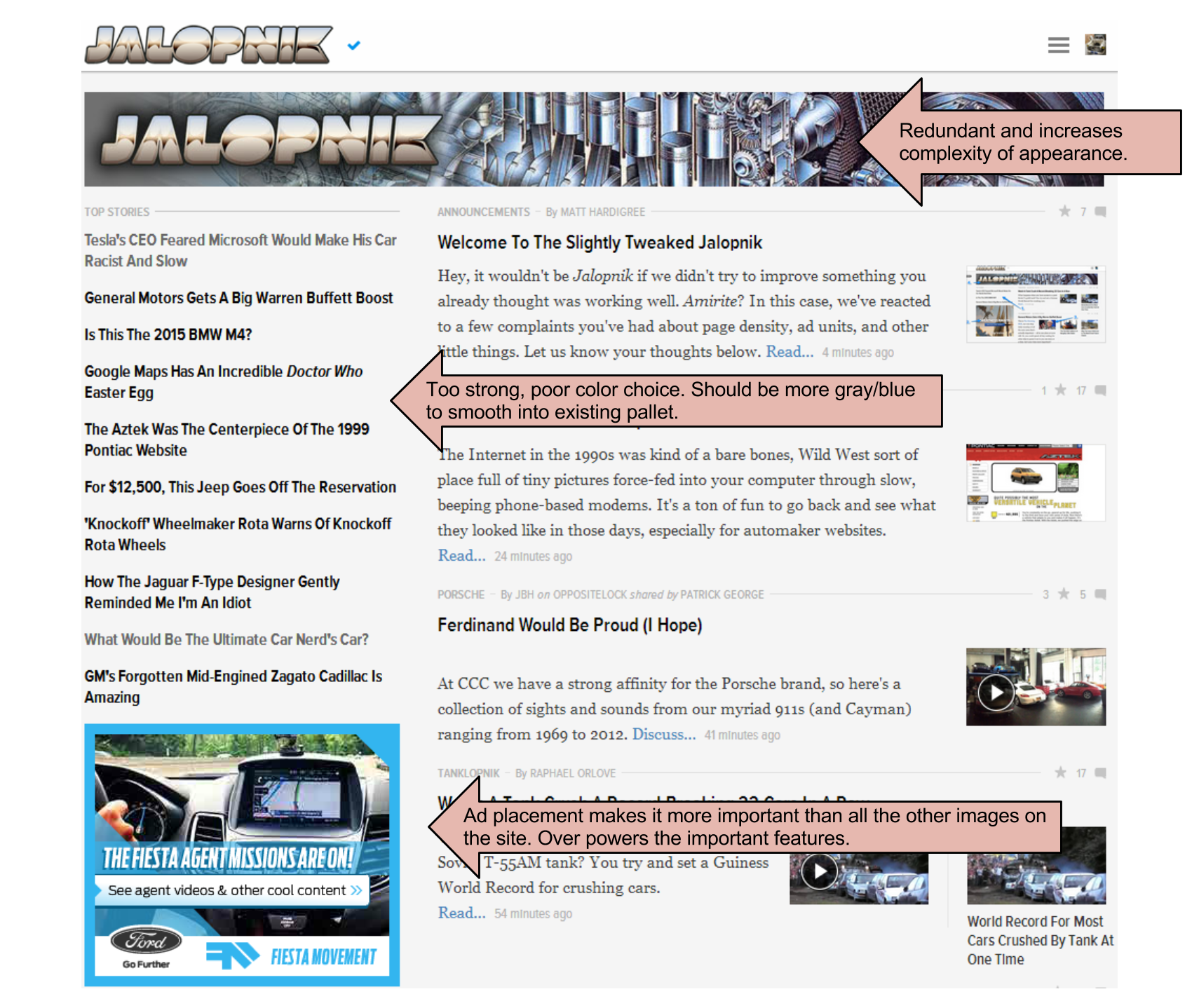
There are a lot of people unhappy with the layout change. Rather than just complain, I thought I would try to figure out what exactly it was that I didn't like and offer suggestions (not that anyone will read them). I am not a dedicated designer and this was done quickly in Google Draw, so bear with me. As I see it there are 3 main elements on the page causing 90% of the immediate displeasure.
The first is the title image duplication. This is extremely amateur (sorry). It's a layered image with a black glow around the title on top of a faded graphic. When I have to mock things up to send to designers, I avoid basic issues like this because I hate the snickering that will follow. It presents nothing and serves no purpose other than filling a banner slot, but steals a lot of attention.
The next major issue is the intensity/contrast of the "TOP STORIES". The text is too strong, it over powers the main content to the right. Tone it down into blues or grays, make it more like the title of the content control, but just more obvious. This will make the page feel less cluttered and allow the tiny images on the right to stand out more in my opinion.
The last major issue I have is the ad. This location and image grant the ad more screen presence and attention then even the main content of the site. It's so much brighter/bolder than the body that as soon as the page loads all I see is the top stories and advertisement... I have to try to focus past them to see the actual content.
What does Oppo say? Do you guys have the same issues with the site I do or is this personal preference?
 ncasolowork2
> Casper
ncasolowork2
> Casper
08/15/2013 at 11:39 |
|
Wow your FP looks a LOT different than mine. The redundant Jalopnik banner is a blank white box on mine. I only have 2 top stories headlines on the left and have no ad. I don't have ad block AFAIK.
 ttyymmnn
> ncasolowork2
ttyymmnn
> ncasolowork2
08/15/2013 at 11:40 |
|
You might have some weird, old version of Flash or something. Or you've got an AdBlock you don't know about.
|
Casper
> ncasolowork2
08/15/2013 at 11:41 |
|
Yeah, that's why I thought I would do an image. I wasn't even sure we were all having the same issues with it. It's really rough.
|
ncasolowork2
> ttyymmnn
08/15/2013 at 11:42 |
|
oh if that's why... flash isn't even installed.
 Z_Stig
> Casper
Z_Stig
> Casper
08/15/2013 at 11:43 |
|
The new layout is just too busy. Your eye is trying to focus on one thing, but all the elements of the design are trying to pull your eye every which way.
 Anon
> Casper
Anon
> Casper
08/15/2013 at 11:43 |
|
I don't even know if that would fix it! It just look very amature! It looks like a geo city page!
 Stef Schrader
> Casper
Stef Schrader
> Casper
08/15/2013 at 11:46 |
|
I chuckled hard when I saw a big banner for my day job on the page for my side job.
Anyway, most of my issues was with the drop-downs up top being too long/not intuitive and the lack of big pictures at top. I do think the main content should be more centered, though.
|
Casper
> Anon
08/15/2013 at 11:51 |
|
Oh. My. God. You're right. That's what it reminds me of. It is a Geocities page with some Photoshop flare.
|
ttyymmnn
> ncasolowork2
08/15/2013 at 11:52 |
|
That's just a guess. I'm fairly certain the big square ad is a Flash deal, since it's always changing. But I know diddly squat about that sort of thing.
 Cloud81918
> Z_Stig
Cloud81918
> Z_Stig
08/15/2013 at 12:35 |
|
Completely agree. When I arrived this morning I thought is was an error. Perhaps a screwed up style sheet. I don't understand where to look. Articles don't stand out. I see strange related articles to there right along with old images, so I think the new article is old. It look a bit better on my larger monitor at home, but it is really bad here at work. It looks like a jumbled mess.
 Giles007
> Casper
Giles007
> Casper
08/15/2013 at 20:24 |
|
Has anyone noticed that when you shrink the browser the images increase in size. Looks like old school Jalopnik.